Understanding Usability Heuristics - Part 1
Evaluating a design of user interface by Jakob Nielsen's 10 general principles for interaction design helps us to identify any problems associated with the design.
October 3, 2023
Most of us wonder what is design actually. How does a designer design an experience? Designing something to user's and make them like your product is something very challenging.
Understanding the targeted users is the best way to create a design that really connects with them. What the user's see and what they feel are two very different things. What the users see is an aesthetic experience and what they feel is psychological one. To create a good design, both are very essential. So for a design to make a worthwhile impression on the user, Designer needs more than a basic understanding of the psychology of their users.
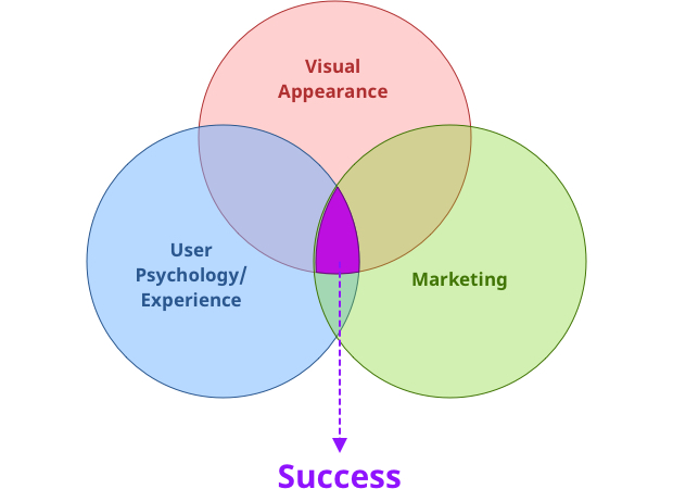
According to me, for a successful design you need to have a Appealing Visuals , should have a good user experience and needs to be marketed well.
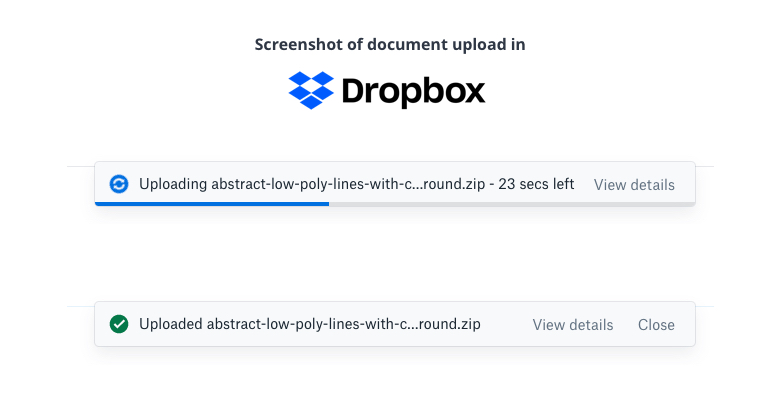
 Screenshot: Document upload in Dropbox
Based on Human behaviour or Psychology of user, Jakob Nielsen's 10 general principles for interaction design is very helpful for creating and evaluating the designs. They are called "heuristics" because they are broad rules of thumb and not specific usability guidelines.
Jakob Nielsen's 10 general principles for interaction design are:
- Visibility of system status
- Match between system and the real world
- User control and freedom
- Consistency and standards
- Error prevention
- Recognition rather than recall
- Flexibility and efficiency of use
- Aesthetic and minimalist design
- Help users recognize, diagnose, and recover from errors
- Help and documentation
Let's understand how the Usability Heuristics of Jakob Nielsen and Human Psychology are linked.
#1. Visibility of System Status
The system should always keep users informed about what is going on, through appropriate feedback within reasonable time
This Principle states that if the user is engaged, then he/she would like to know what's going on inside the system. User would always be expecting a feedback for his/her action within a reasonable time. One example is when a tweet is posted by a user, Twitter responds it with a swoosh sound. Another example is the status of Document upload in Dropbox.
 Screenshot: Document upload in Dropbox
Proper presentation of available seats and booked seats with price and other details.
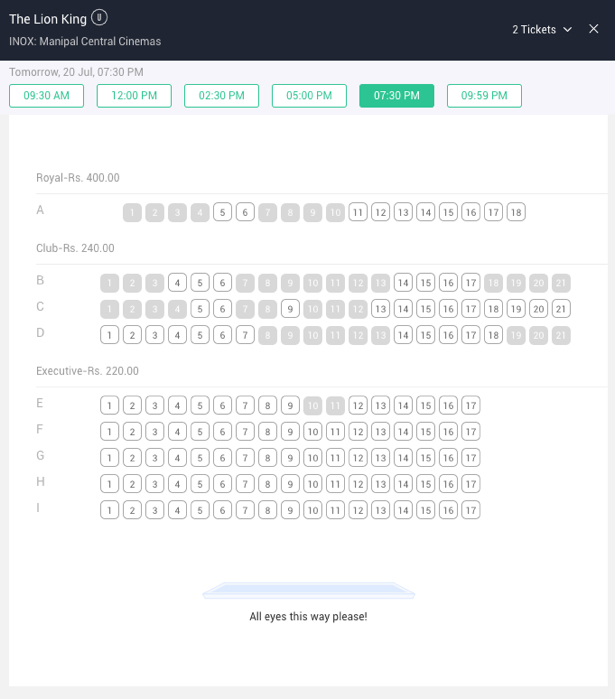 Screenshot: Book my show
When the user does some action or referring to a continuing process, the status should be clearly mentioned until it's completed. Communication and transparency are very important aspect and this builds the trust between the user and the system. This makes the user feel in control of the system and takes appropriate action to reach their goal.
"Lack of information leads to lack of control."
For instance, when you login to the gmail it shows you what's happening in the background and the progress.
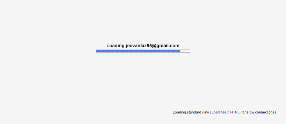 Screenshot: Gmail loading
Whenever users interacts with a system, they need to know whether the interaction was successful or failure. Providing immediate feedback for interactive events allows users to quickly identify the source of errors and fix them as soon as they were made.
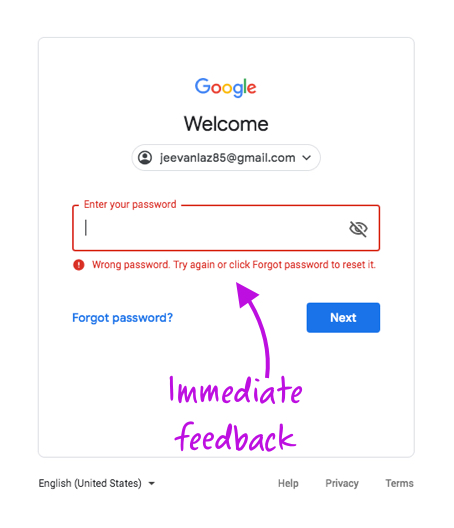 Screenshot: For instance, Google login gives immediate feedback when the user enters wrong password.
When the user knows the current status of the system, then he/she can change it and figure out what is needed to do next in order to reach the goal.
For instance, when you drive a car, you need to continuously see its speed to decide if you need to go faster or slow down.
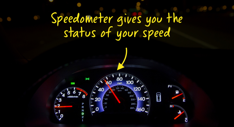 Speedometer is an indicator that displays you speed/current status of your car
To communicate a backstage event, notification or indicators can be shown.
For instance: In an ecommerce app/website: If people know that there are just a few items left, they are more likely to act immediately.
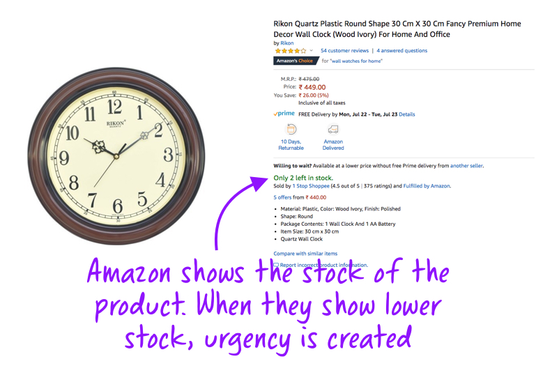 Screenshot: Amazon
No action that affects the users should be taken without informing them. When a change is caused in the state of the system, explain it in brief but in understandable terms.
Users who are uninformed about the system'current status cannot decide what to do next in order to accomplish their goals, nor can they figure out if their actions were effective or if they made a mistake.
For example, what should happen when a user revisits a previously created wish list that now contains items that are out of stock or no longer sold? The worst user experience would be if those items simply disappeared from the list, with no explanation why. A better way to build trust is to explicitly communicate to the user about the items that are no longer available so that the user can either remove them from the list or keep them for future reference.
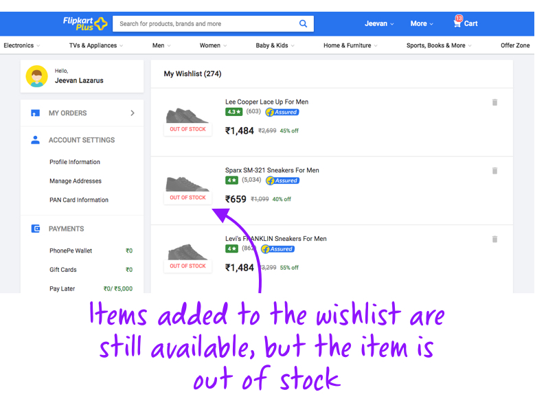 Screenshot: Flipkart
#2. Match between system and the real world
The system should speak the users' language, with words, phrases and concepts familiar to the user, rather than system-oriented terms. Follow real-world conventions, making information appear in a natural and logical order.
Is there something on your application that a user may not understand when he/she uses it? It's mainly because the application is not able to communicate with the target user base in the language the user understands.
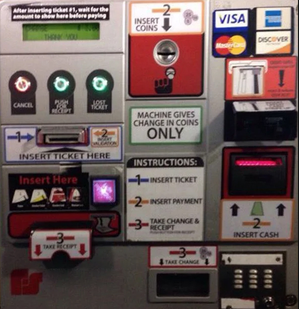 In the above system, user gets confused looking at it as he is unable to know the starting point
Most of the experience in the digital platform mimic one from the physical world, which capitalizes on people's existing knowledge and helps them easily learn an interface without any training. That's because human's build mental models or theories of how a system works based on their past interaction/experiences with the real-world objects. That's why when the transition from the physical world to the digital world, they carry the same interpretations with them. So users expect the objects to work the same way as the real world.
For example, a compass app on the iPhone functions much like an actual compass does in real life.
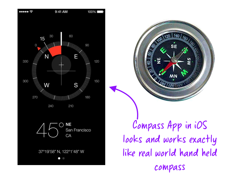 iOS app "Compass" vs Real World Compass
To communicate effectively with the user, the system should speak the users' language with familiar words, phrases and concepts rather than system oriented terms. Applications that are designed following real-world conventions, shows the information appear in a natural and logical order in a way the user's understand.
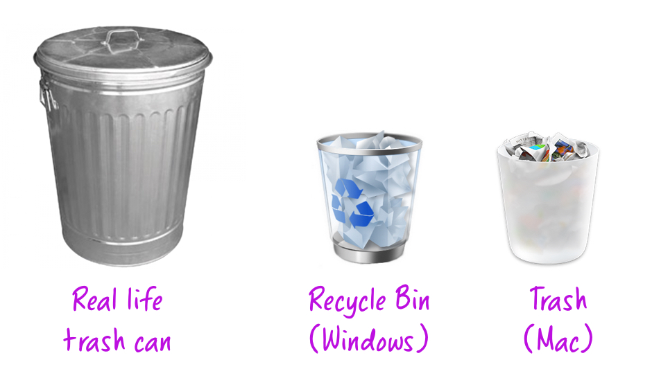 Real Life Trash Can vs Recycle Bin(Windows) vs Trash (Mac)
Most of the time, people do not understand the technical words used on a website or mobile application. This makes them unsure and ignored due to which many will be forced to go elsewhere to find explanations or even to complete the task. So using the familiar language helps the user understand and complete their task.
For example: Jeevan Lazarus could very well say "Sign Up" on his landing page. Instead, he chose to say ambitiously — "Yes, I want to learn UX-UI design from Jeevan." It sets the context and speaks the everyday language.
 An application for signing in to UX-UI Design Course

