Understanding Usability Heuristics - Part 2
Understanding the targeted users is the best way to create a design that really connects with them.
October 4, 2023

After understanding two general principles for interaction design, let's go through next four in this article.
#3. User control and freedom
Users often choose system functions by mistake and will need a clearly marked "emergency exit" to leave the unwanted state without having to go through an extended dialogue. Support undo and redo.
This principle is about giving the user the freedom to navigate and perform actions in a system.
If something isn't working for the users then he/she should have flexibility to edit or undo. For Instance, Imagine you have changed your residence and you are trying to order something through an e-commerce website/app. Now, during the ordering process, what if the system does not allow you to change the address. You would probably switch to another ecommerce website/app where you will have the freedom to edit or change the address.
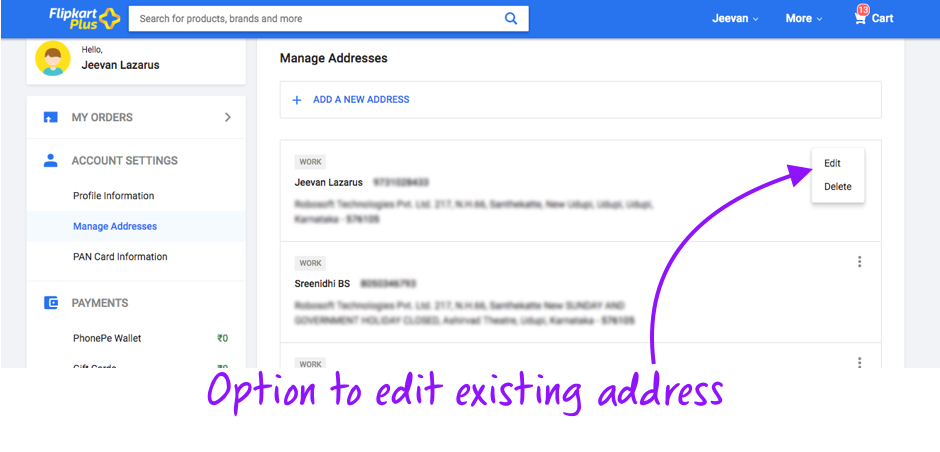 Screenshot: Managing addresses in Flipkart
So whenever building a User Experience, it is very important to think of various possible instances where the chances of making mistakes could be high. Also give the users the freedom to modify things (like user's physical location, their bank details, their contact details, etc) which are subject to change. This flexibility to modify/edit is enough to make the users handle any mistakes.
Users should have the freedom to undo any accidental actions. So our product should not punish them but instead, reassure them that you have their back.
For example, Flash message in Gmail with undo action when an email is deleted accidentally.
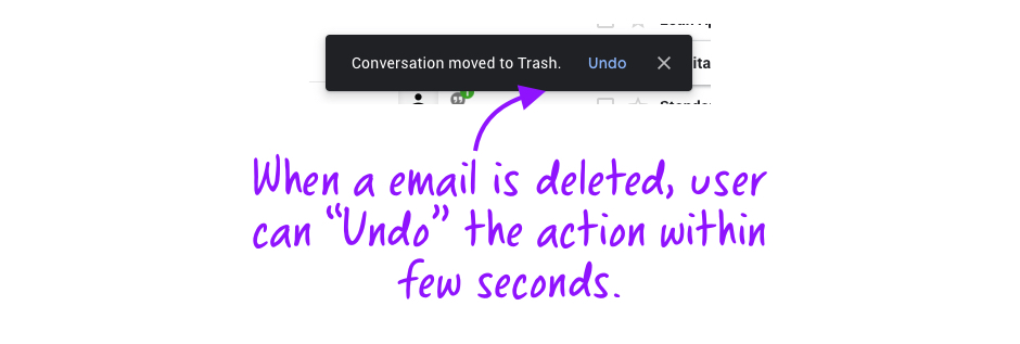 Screenshot: Gmail - The best example for this principle can be seen by a flash message with undo action when an email is deleted accidentally.
File upload process can be cancelled in Google Drive before its fully uploaded by clicking on the "Cancel" Button .
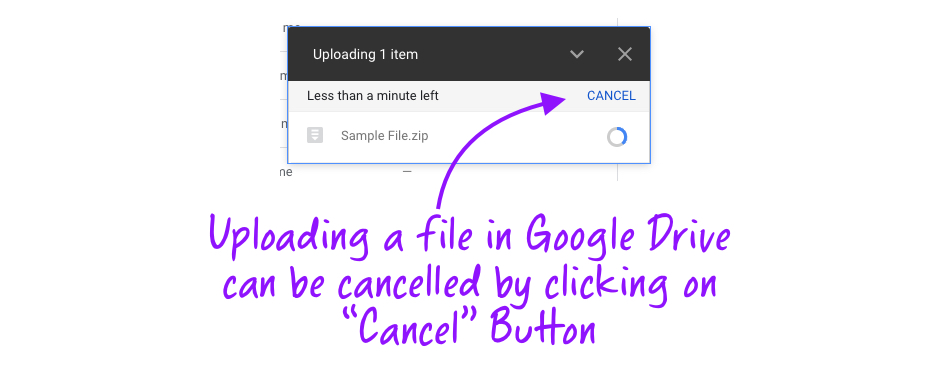 Screenshot: Google Drive - Cancel Upload in using "Cancel" Button
#4. Consistency and Standards
Users should not have to wonder whether different words, situations, or actions mean the same thing.
This principle is very essential in design and this needs to be followed throughout the content and interactions within your product. Few aspects which needs to be taken care when improving the designs are:
- Layout
- Visual Components - UI elements, fonts, color
- Features
- Functions/Interactions
- Language
Consistency helps in improving the user experience by eliminating unnecessary learning and confusion for the users. It needs to be used wherever necessary without restricting your innovative design ideas.
Following Standard allows your users to understand every individual element in your interface designs which helps them to know where to look for what features.
"Consistency results in efficiency and perceived intuitiveness"
Over the period of time, users have been associated with few conventional layout patterns of User interface. In the below example of e-commerce websites, placement of the logo has been on the top left, search in middle, sign-in, profile details and shopping cart information at the top right corner.
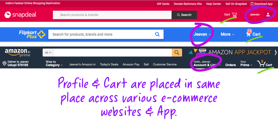 Screenshot: Consistant placement of Search, Sign-in, Profile and Cart in e-commerce websites
With so much exposure and experience with the interfaces, our brain has created patterns and now we look at the specific things at specific places.
For instance, Imagine each time you login into your email and you find the form fields are placed differently?
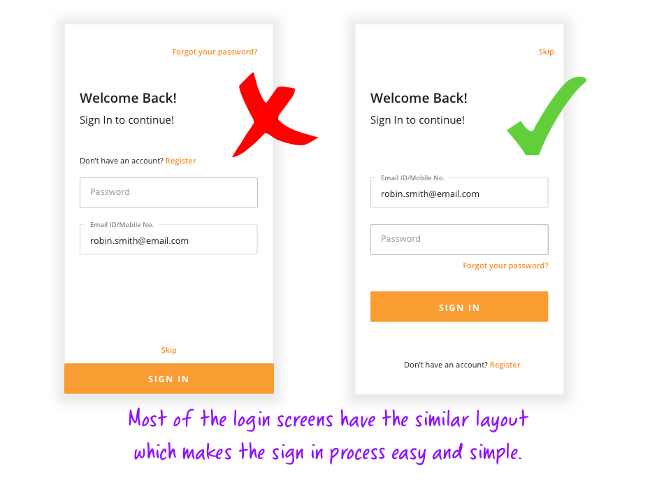 Login screens
Visual consistency is essential while designing a system where overall system should look unified right from the fonts of heading and body text to colors used on the interface. This can be achieved by following the brand guidelines and design systems for the product. If the visual consistency is not followed, whenever user navigates from one screen to another, they feel that they have arrived at a new website.
 Consistancy needs to be maintained throughout the website/app
Along with Layouts, certain icons too have conventional meaning. For example: Star is for favorite, a plus sign for increase while minus is used to indicate decrease.
 Screenshot: Consistant placement of Search, Profile and Cart in e-commerce websites
Based on interaction with website or an app, users expect certain Functional Consistency throughout the processes.
Example, On WhatsApp, the floating action buttons remains at a fixed position and the only thing that changes is the icon that represents the action that is relevant to that screen.
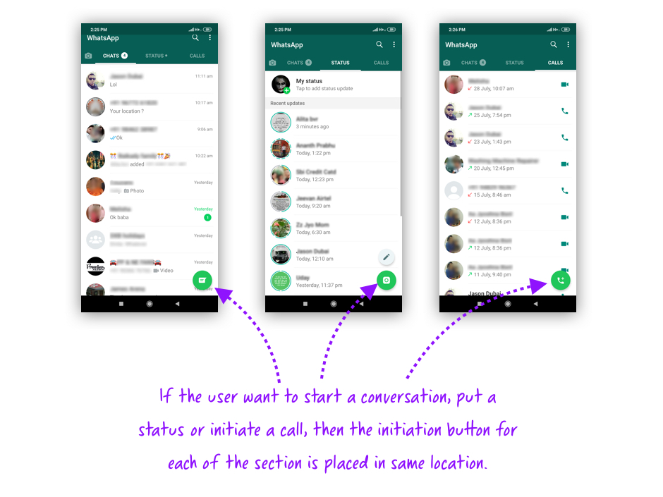 Screenshot: Chat, Status and Call sections of Whatsapp
Tone or the language used in the interface design needs to be in sync with the brand. The tone of voice describes how your brand communicates with the audience and thus influences how people perceive your messaging.
Mailchimp is an iconic brand who uses offbeat humor and a conversational voice in all brand communication, and their 404 page is no exception.
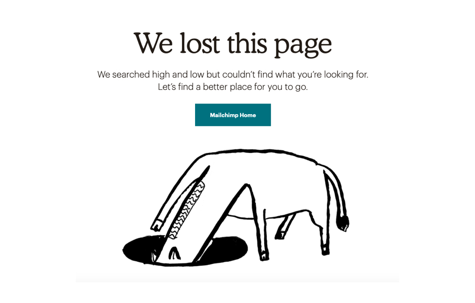 Source: Mailchimp
To provide the user a usable and consistent experience, platform specific guidelines like Apple HIG, Material Design, Bootstrap, etc needs to be followed along with the brand guidelines.
User interface design needs to be consistent throughout because users like to buy products from the brands they know and trust. If their experience is inconsistent that results in the lack of trust and loyalty.
#5. Error prevention
Even better than good error messages is a careful design which prevents a problem from occurring in the first place. Either eliminate error-prone conditions or check for them and present users with a confirmation option before they commit to the action.
Good products informs its user about an error but the best products prevent an error to happen. A good experience for the user is created when the errors are prevented. There are few methods which can be used to prevent errors.
Instructions needs to be laid out before hand. User will be pleased if there are instructions that are told to them beforehand.
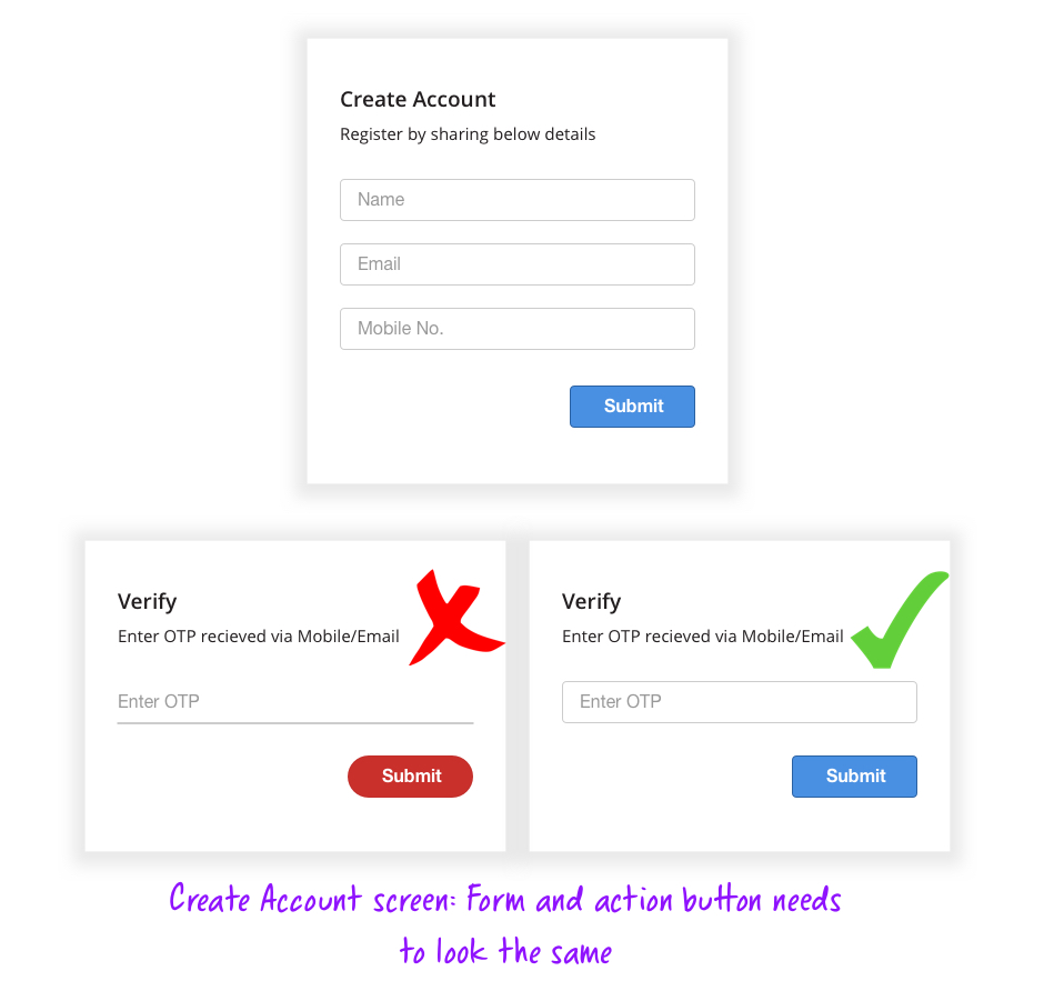
Below example illustrates error prevention perfectly. The users are given a feedback as soon as they meet the right condition for the password i.e. if some rules are set for the format of user password, it is validated instantly rather than waiting for the user to click submit.
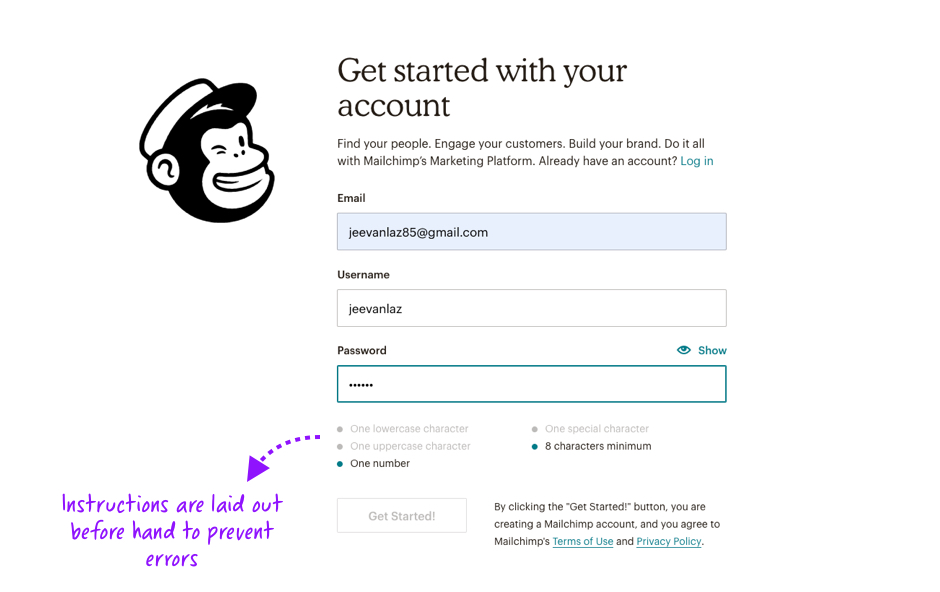 Source: Mailchimp - Create Account
Offering suggestions to the users while typing is another method where the users get a contextual search word suggestions. This type of error prevention method is mostly followed by e-commerce websites as well as a search on Google.
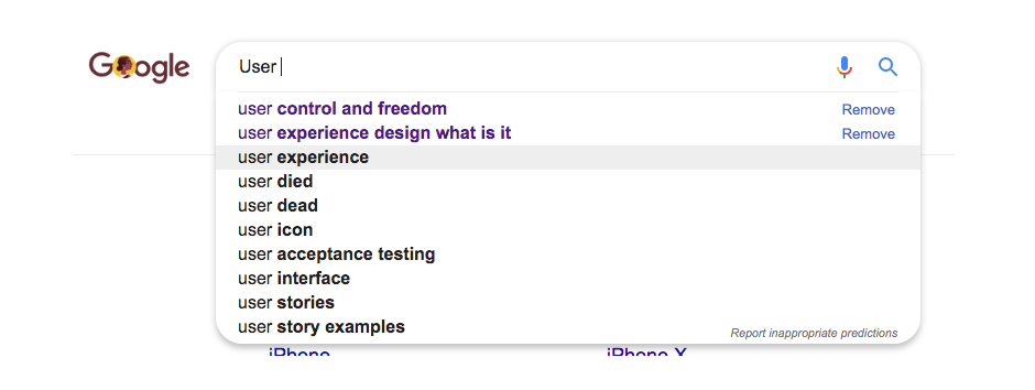 Screenshot: Google search showing error prevention
Flipkart demonstrates its users where to find a CVV number of their card to support users who might not know where to find them.
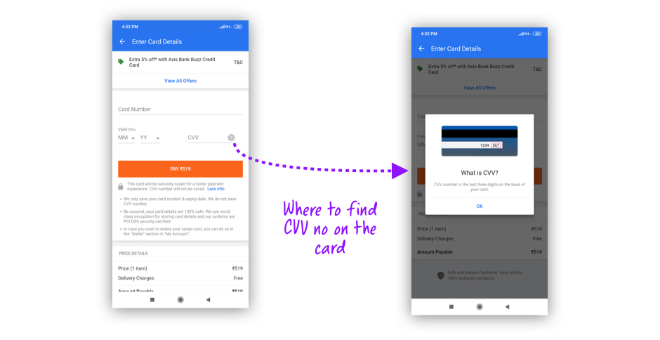 Screenshot: Flipkart
Auto correction may seem like a good option for error prevention, but make sure that users have the freedom in choosing whether or not to go with the suggestions offered.
For instance, when you mistype a word in Google search, the search result you get is for the correct word but still it gives the user the freedom to search for the word or phrase they had typed before. Here two heuristics are followed, one is preventing an error and other one is user control and freedom.
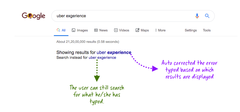 Screenshot: Google
Sometimes user's get distracted from the work he/she is doing due to which unconscious errors happen. These kinds of errors can be prevented by taking Confirmation which makes the user confirm his/her decision and this can help the users retract from errors if it happened by mistake.
When you try to send an email without the subject, email client smartly detects and warns you before you send the email.
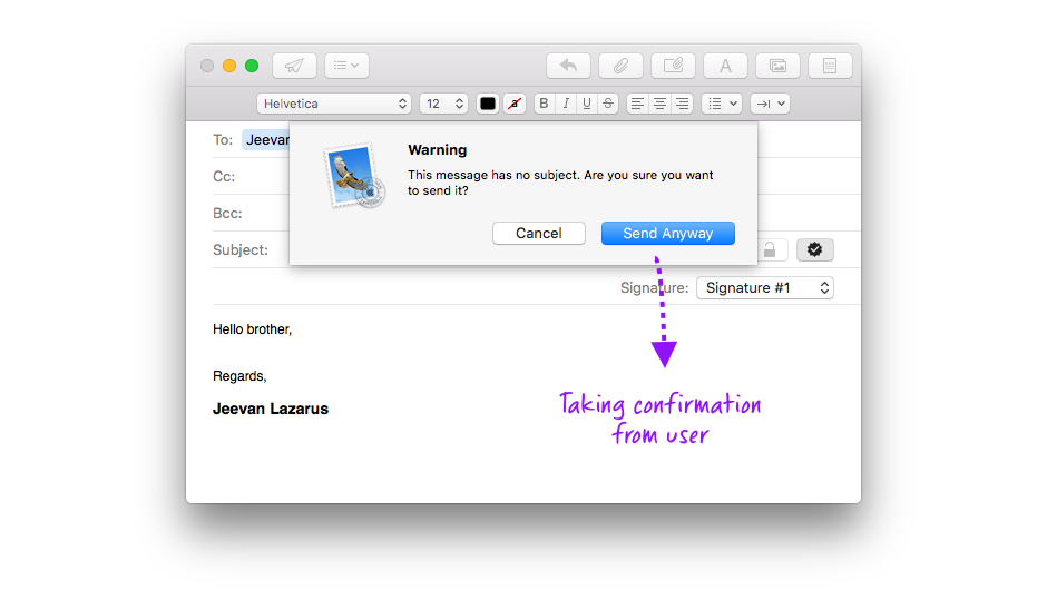 Screenshot: Mail
If the users data is already available, do not ask the same data again. Asking similar kind of data leads to more errors. Preventing these kinds of errors reduces the burden on the users and guide them when precision is required.
Most of the e-commerce website/apps do not ask for the long card number if the user has used the card previously. It will just ask for 3 digit CVV number to prevent mistakes when entering the long card numbers.
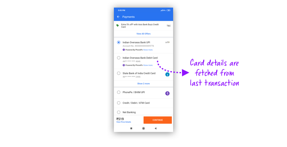 Screenshot: Flipkart
To prevent errors experience of the user needs to be in mind when designing. By building good mental model of the user interface for our users, errors can be prevented. Users need to be encouraged to double check their work and warn the users before any mistakes are made. Following these simple guidelines, user errors can be lowered and ultimately the products usability can be improved.
#6. Recognition rather than recall
Minimize the user's memory load by making objects, actions, and options visible. The user should not have to remember information from one part of the dialogue to another. Instructions for use of the system should be visible or easily retrievable whenever appropriate.
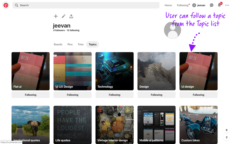
Providing the user with a set of options rather than making him remember and type the whole thing. This would minimize the user to stress on his memory.
Below is an example of Google suggesting possible content based on what I am trying to type.
Screenshot: Google search suggestionsOne more example is when Pinterest lets you pick the topics of interest from a list of options rather than asking you to type all of them which would have been disastrous.
 Screenshot: Pinterest
The human brain retrieves information through Recognition rather than recall so recognizing a familiar face is easier than actually recalling the name. This is because to recall something, the brain has to exert that leads to cognitive load. Recognizing is mainly through retrieving information through cues involving various stories or context or senses.
There are various methods that helps us follow this principle. It's always better to follow certain experiences and mental models when creating interfaces because there are certain things users do in a certain way. So do not reinvent the wheel unnecessarily. So creating analysis of competing products helps to understand the UX Flows and patterns in them.
For instance, customer journey of user ordering food through Food Delivery applications.
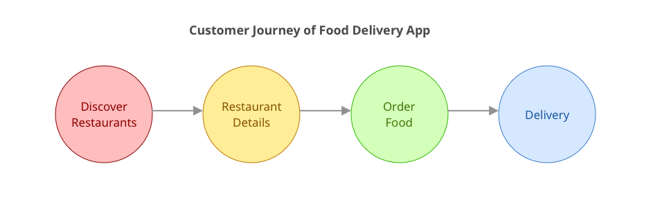 Screenshot: Food Delivery App customer journey
Its always better to give the context to remember so the users can continue from where they have left previously.
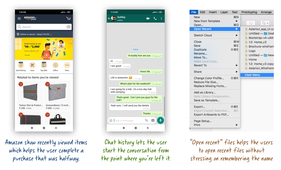 Screenshot: Amazon, Whatsapp and Sketch
It is always better to give our users enough context and cues which would help them figure out what they need to do next. If the users have to start from the beginning every time, then that would make them doubtful and chances of creating errors would be higher.


