Understanding Usability Heuristics - Part 3
General rules of thumb which are applicable to any web & mobile application with some exceptions by keeping yourself in the end user's shoes.
October 5, 2023

After understanding six general principles for Usability Heuristics in interaction design, let's go through next four in this article.
#7. Flexibility and efficiency of use
Accelerators — unseen by the novice user — may often speed up the interaction for the expert user such that the system can cater to both inexperienced and experienced users. Allow users to tailor frequent actions.
This principle is about giving your users ways to speed up their work with more efficiency and flexibility.
The Interface should be flexible transforming itself between a novice user and an advanced user. Usually advanced options are available when a user installs a new software where the user can choose between, default installation or custom installation. Custom installation will be mostly used by the advanced user to install only necessary services.
Below is an example shows Outlook setup which hides the complex features under Advanced.
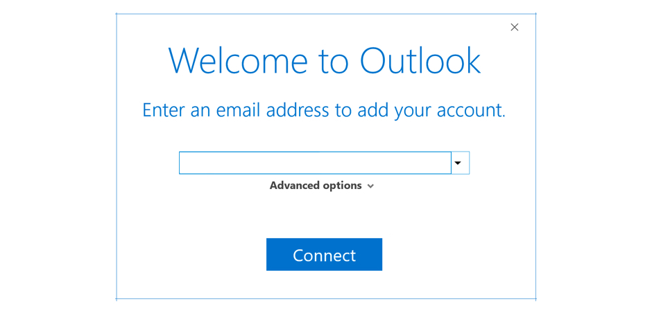 Screenshot: Outlook showing advanced options during email setup
Best example of Flexibility and efficiency principle is the use of shortcuts.
Every software installed in our computer has shortcut commands which the users can use for efficiency. Shortcut commands like copy, paste, cut, red and undo are the same across all the softwares. As users are used to this, they will be able to do this task easily. Even though any new shortcut commands are user, with repeated use, users will get used to it.
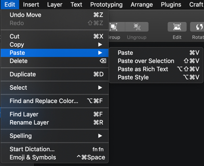 Screenshot: All softwares has universal features under Edit with same shortcuts
Users efficiency can be enhanced by giving them access to functionality that they need or use the most.
If you take an example of a financial app, where the user wants to send money, providing them with a list of recent or common beneficiaries in the beginning followed by a list of all beneficiaries in alphabetical order and a search option will help the users will help them find the beneficiaries faster.
Below is an example of PhonePe application, where it shows my recent transaction contacts as well as option to search other beneficiaries
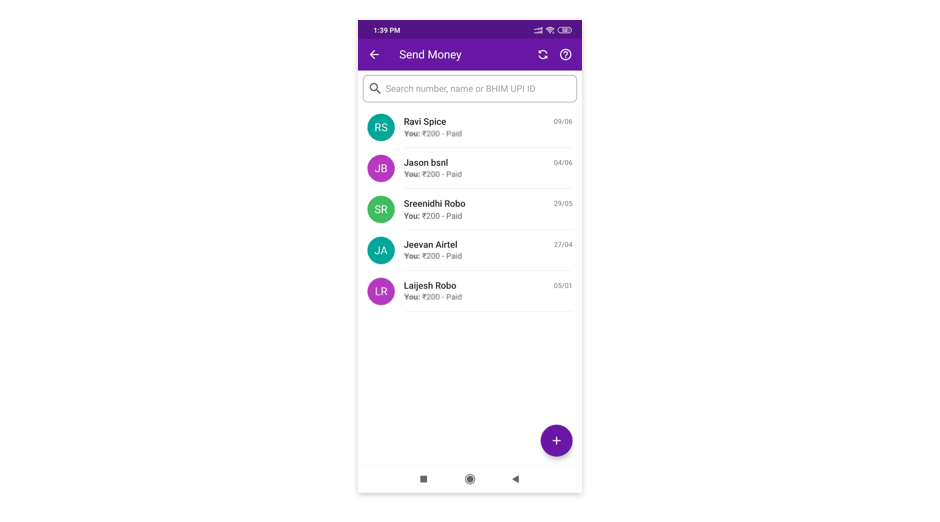 Screenshot: Send Money option in PhonePe mobile app
When users are provided with more flexibility, then the overall user experiences will be more enjoyable and efficient. This can be achieved when the user is provided with an opportunity at certain points of the user journey to save time or skip the lengthy process.
Efficiency is all about how quickly the user completes their goal with a high degree of accuracy. This can be achieved by creating an effective user journey.
Example: in Amazon, my previous used credit card details are saved. On selecting the card used previously, I just need to enter the password to do the payment. This saves users time in entering the details again.
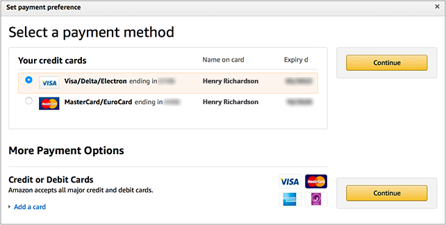 Screenshot: Amazon Payment screen
#8. Aesthetic and minimalist design
Dialogues should not contain information which is irrelevant or rarely needed. Every extra unit of information in a dialogue competes with the relevant units of information and diminishes their relative visibility.
We should know that only limited information can be processed at a time by the human brain. So when the interface is too cluttered with a lot of content or elements, it makes it difficult for the users to focus or function properly. So aesthetic and minimalist design is important.
Below is the example of a website which too cluttered.
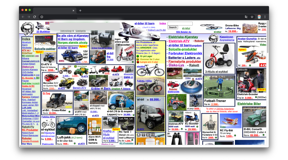 Screenshot: Cluttered Website
Look of the product influences the users strongly. If the product design looks clean and pretty that it is better accepted by the users than the products that are less prettier.
"Any product or website that looks aesthetically great, then there is a very high probability of it being used."
It's always great to have a great visual appearance for the product along with great user experience. Visually great designs bring positive attitudes among the users and it makes them tolerant of any minor usability issues.
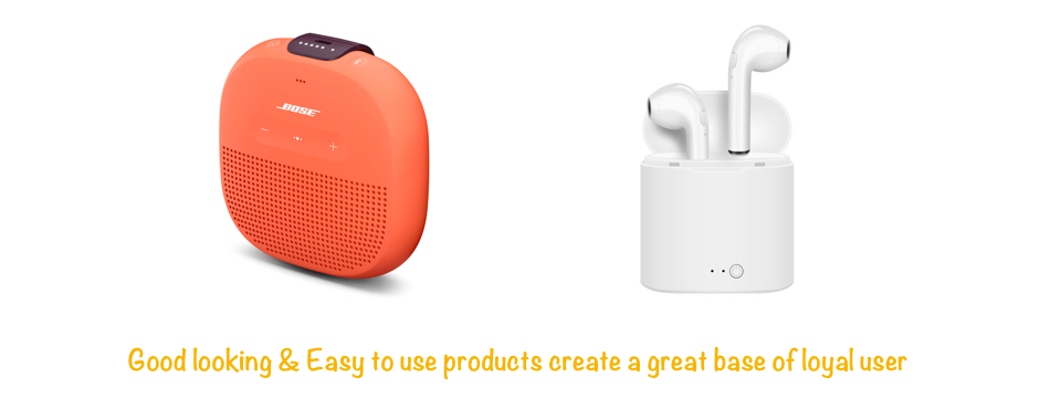 Screenshot: Products that look great
Aesthetic designs are effective in bringing up positive attitudes and this makes people more tolerant of design problems or minor usability issues.
As a product designer, discuss with the end users to understand what is necessary and useful information that needs to be displayed. Information on the layout needs to be prioritized and cleared of unnecessary elements and content that does not support page goals and tasks.
The best example of minimalist design is Google as they have kept search pages simple and straightforward i.e. search what you want without distractions.
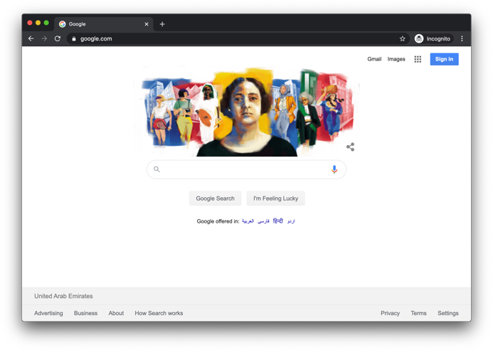 Screenshot: Google search
If you have created something that needs a lot of content, think of ways to organize it in proper hierarchy and sections. This is an important concept of aesthetic and minimalist design.
Apple website is the best example of minimalistic design. Here the product with its basic information is shown. More detailed features can be seen under the "Learn More" option. But the same product if seen on any other ecommerce website, you will realize how clutter free experience is important.
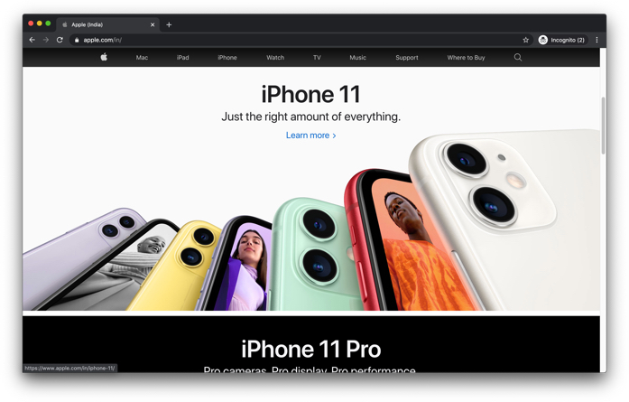 Screenshot: Apple Website
#9. Help users recognize, diagnose, and recover from errors
Error messages should be expressed in plain language (no codes), precisely indicate the problem, and constructively suggest a solution.
An error message that a user cannot understand is the worst kind of experience a user is facing. It's always better to use plain language that a normal user can understand rather than using vocabularies/technical jargons. Using plain language to communicate with the user will help the user recognise the error, diagnose and recover from the errors.
Some helpful tips along with examples below will explain this principle better.
"Don't just help the user understand what has happened.
But help them what they need to do next."
Simple and action oriented error messages gives the users an option on what they should be doing next. Below example explains how messages are conveyed to our users.
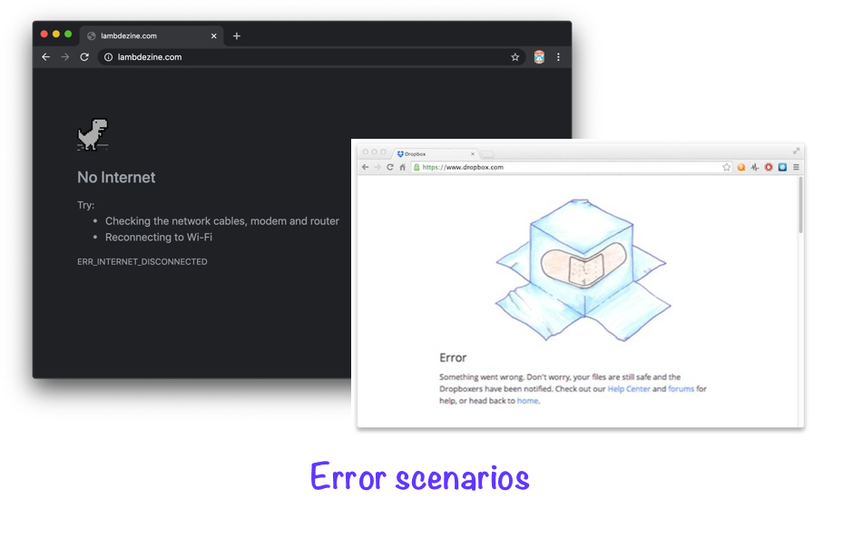 Screenshot: Error scenarios in Google chrome when the internet is down as well as Error Scenario when using Dropbox
"Don't use error messages that are difficult to understand."
In a scenario, where the user has entered wrong details in the input field, show the error message along with the feedback to let them know where and what went wrong. Also tell the user on how they can recover from that error.
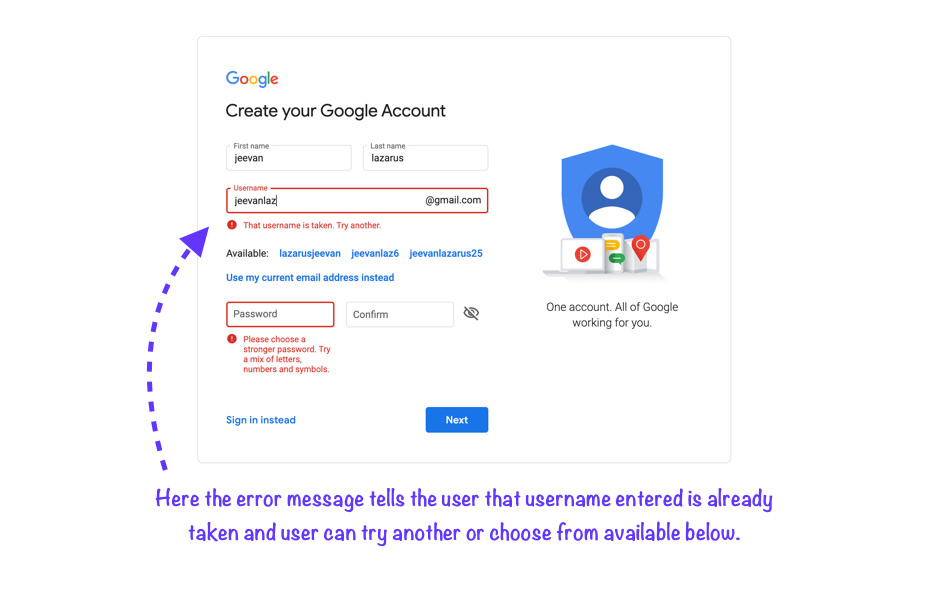 Screenshot: Creating account in Google
"Use of appropriate colors to highlight errors."
It's a wonderful practice to highlight errors using colors along with a written error message. It's recommended to show error by using shade of red as it matches the real world STOP signals.
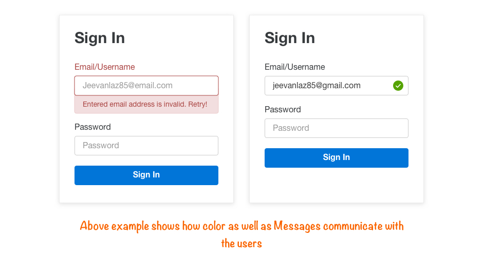 Screenshot: Example color and Message communicating with user
Color as well as error message has to be shown together, else people with visual disabilities and color blindness will not be able to identify errors. If only error symbols with color are shown, then the user won't be able to understand what the error is.
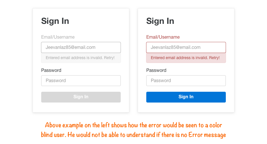 Screenshot: Error message whon to color blind user (left) and normal user (right)
Helping the first time users as well as elderly users to recover from the error will help them build trust with the system, else they will be fearful to use the technology because the system has not helped them to recognise, diagnose and recover from error. So it is very crucial to let the user know about the error and communicate with them on what to do next with a proper message.
#10. Help and documentation
Even though it is better if the system can be used without documentation, it may be necessary to provide help and documentation. Any such information should be easy to search, focused on the user's task, list concrete steps to be carried out, and not be too large.
When building a product, our primary goal is to build a product that is so easy that the user dont need documentation and help. But sometimes when users run into problems then they need to be assisted with ways to resolve them. So having a clear documentation and ways to resolve the issues bring in positive feelings. This way help and documentation is important.
Proper assistance as well as the information should be present in the right place.
Below is the example of a Amazon product detail screen, Where the user is trying to purchase a product. Displaying the "return & exchange policy" or the link to it is be more beneficial rather to the user than just limiting it to the FAQ or Help section. Also size chart relevant to the product user is checking will assist in making the right purchase.
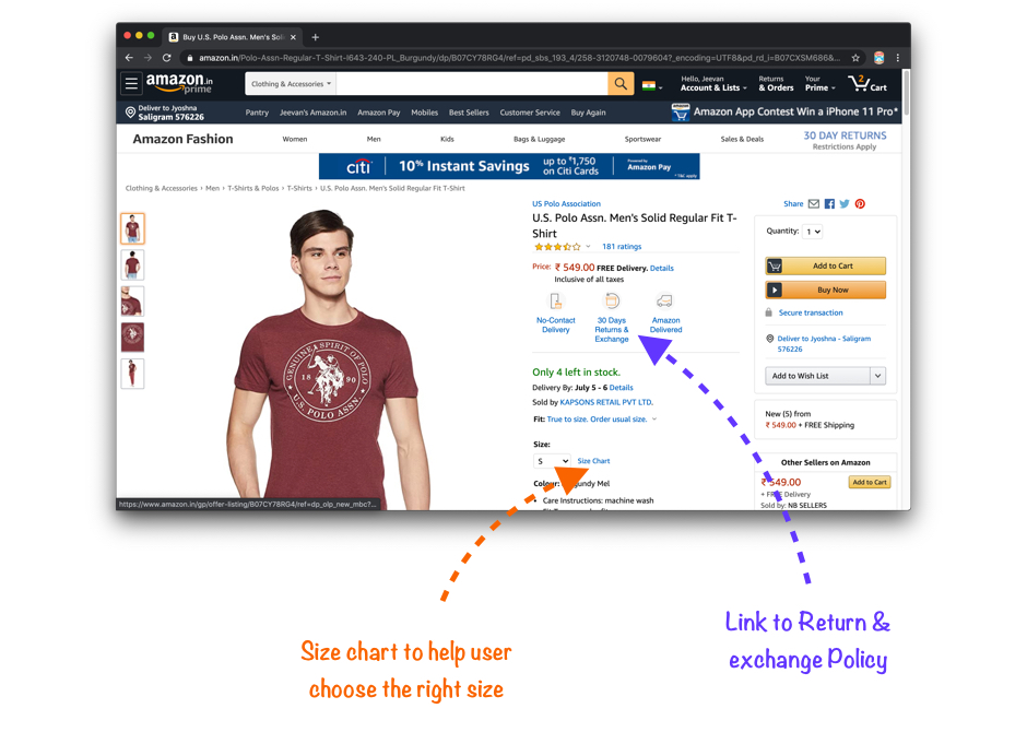 Screenshot: Amazon - Product detail page
Even though the goal is to make sure that the users are not facing any frustrations, but a good help and documentation can be crucial in times when the users are struggling with our product.
Below is the example of "Pepperfry" website where it is helping the users on how to buy a proper product.
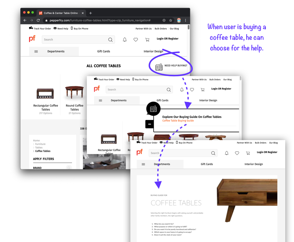 Screenshot: Pepperfry website - Need any help
Categorizing or grouping the sections will help the user to pick the right section to find the solution.
Below example shows how help section is organized in flipkart. FAQs section helps in solving possible errors and its solution from previous section. Postal address or customer care number helps in connecting with the team as some users prefer connecting with humans rather than looking at the documents.
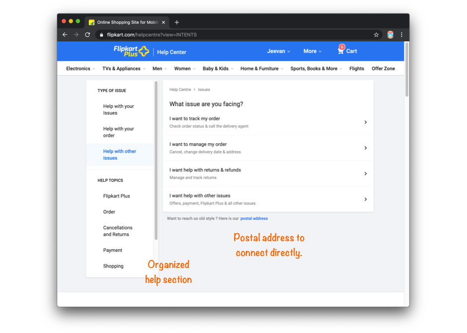 Screenshot: Flipkart website - Help section
These are are general rules of thumb which is mostly applicable when building a website and mobile/web application with some exceptions. Whenever implementing these principles or any other UX practices its always better to use your judgement by keeping yourself in the end user's shoes.
Hope you liked it!!!


